Therapeutic Goods Administration

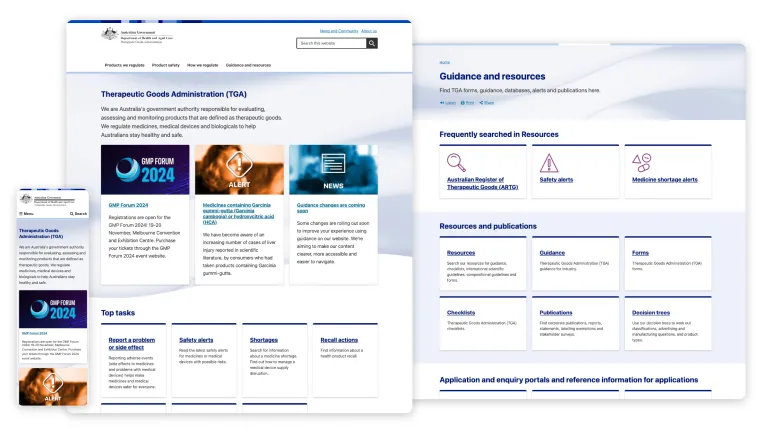
Morpht implemented a contemporary look and feel and uplifted the complex content with a consolidated and consistent content model and reusable patterns. This equipped the TGA with the tools to focus on delivering rich and complex guidance for varied audiences. 


Overview

Drupal 9 | Convivial GovCMS | Web development | Content migration

The Therapeutic Goods Administration (TGA), as part of the Department of Health, regulates the quality, supply and advertising of medicines, pathology devices, medical devices, blood products and most other therapeutics.

The TGA provides essential information and services to health professionals, pharmaceutical industry, device manufacturers and the general public. Its central website plays a pivotal role in disseminating vital safety updates, advice and guidance. Supported by an ecosystem of portals that service the industry, it attracts more than 5.5M visitors a month and generates $1.5B in service transactions.

The site was burdened with more than 15 years of design, content and technical debt. It needed a re-imagining and overhaul to better service its audience. The TGA initiated a substantial digital transformation program of works where the main site played a central role in leading the way in the approach and solution. 

The TGA commissioned Health’s design partner Folk to lead the discovery, user research and design. Folk in turn engaged Morpht - as part of a long standing collaboration - to conduct the technical investigation and redevelopment of the site.
Visit the site

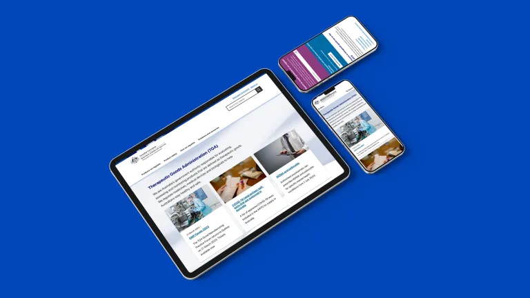
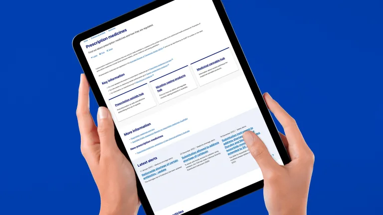
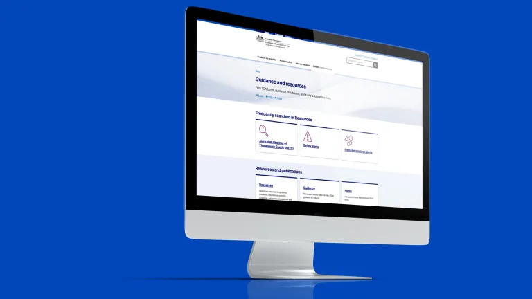
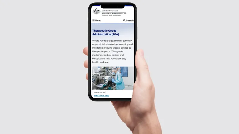
TGA website screenshots

The challenge

In exploring and auditing the setup and architecture of the legacy site, we identified inconsistencies and fragmentation of information and functionality which were eroding the user experience, trust and confidence in the service and information provided. This also added to the cost of the maintenance and support of the site. Some of the issues we identified were: 

71

content types needing to be retired or consolidated

39

data feeds not inter-linked to provide the full picture

56

taxonomies mostly redundant or not efficiently filtering content

45000

content pages to review, update and migrate

The solution

While it’s no easy feat to sum up a year’s worth of work in getting the site over the line, three key themes emerge: 

  • Search and findability
  • Structured content
  • Consistent and consolidated experiences 
TGA device mockup

Structured content

As is customary at Morpht, our investigation pivoted around an extensive content modelling exercise to define content types and how they’re inter-related along with supporting taxonomies. We collaborated with the TGA User Experience  and Web teams to improve, rationalise and consolidate the 71 content types down to 49. We also established a key content type to surface all records from the ARTG data feed, expose each as a node with a unique URL. 

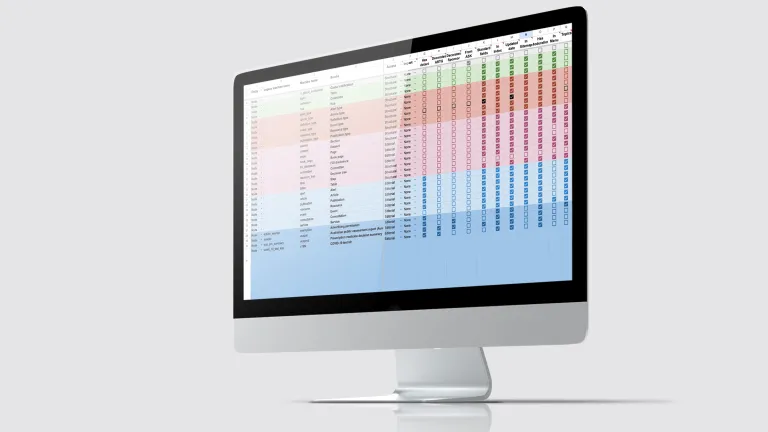
TGA content strategy

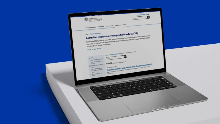
ARTG

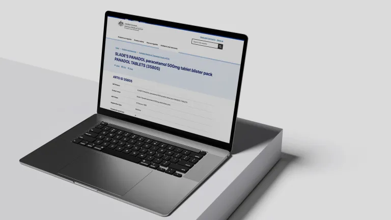
Knowing that the ARTG is the most accessed central database of more than 95,000 records of registered goods, we took the opportunity to create a node for each record and expose relationships to other data feeds. The aim was to give the user access to more connected information about the stages a registered good goes through. This also supports SEO to help improve the TGA’s ranking and authority in this space.

Ingesting the ARTG feed was especially labour intensive where we crafted and reworked scripts to create new nodes, check for updates, duplicates and unpublish deregistered goods. We enabled a faceted search interface to empower the user to find and filter content and access other related information about a product. We also made the ARTG search accessible from key pages on the site in addition to the main site search.

TGA ARTG search

Search and findability

To give users immediate and easy access to data and content, we equipped them with 31 contextual faceted search interfaces, aside from the main site search. Users can now search through safety updates, product alerts, publications, as well as 17 different data feeds, most of which are associated with and linked up to the ARTG database.  The central site search now exposes information from all content types, feeds and the ARTG combined to support those users who prefer to search instead of navigate the site.  

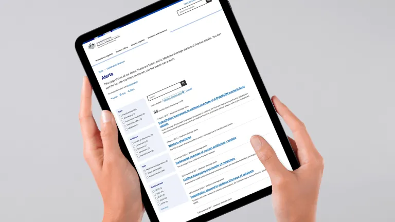
TGA search

Consistent and consolidated experiences

With the aim of enhancing the user experience and focusing on ease of use, crafting consistent patterns was paramount to reducing the user’s cognitive load as they interact with familiar interfaces and navigate clear and simple hierarchies. We created a content type such as ‘Alert type’ as a classifier to surface the latest ‘Product alerts’ on a listing page and promote ones that require immediate action. 
We repeated this pattern for other content types such as News, Publications, etc. 


TGA search on smart phone

Data feeds

Data feeds across the site are now presented with the familiar faceted search interface and individual records laid out in a consistent fashion giving clear hierarchy to the presentation of data points.

TGA consistent experiences

Powerful magnets

We introduced the concept of a content magnet and the TGA fell in love with the idea. This is a component an editor can place on a page and configure it to display content from a variety of content types such as alerts, resources, publications, etc based on two classifiers:  ‘topic’ and ‘audience’. The magnet is like the swiss army knife of content management, exposing a wealth of information with minimal effort from the editor. But for the magnet to work we needed to get the house in order with the use of audiences and topics.

TGA powerful magnets

Topics

While these weren't new concepts for the TGA, they were, however, being used inconsistently and without much effect. We uplifted the Topic from the guise of ‘category’, created a node template for it and equipped it with pre-programmed views to surface ‘flow’ content such as news, alerts, updates etc.  We also used the topic as a classifier for most other content types to help expose content in faceted searches and of course the magnets. Editors can now create new topic pages without relying on developer skills. 

TGA topics

Editors tools

At Morpht, we have a long standing commitment to enabling and equipping site managers, editors, authors, and content creators with web management tools to reduce their reliance on developers to create page layouts. The TGA are now able to create new pages following established patterns and layouts, while having the flexibility to craft page layouts by using the extensive toolset we’ve built in Convivial for GovCMS paired with the Awesome Starter Kit developed by the Australian Department of Health Online Services area.

TGA editor tools

Platform and infrastructure

The legacy site was built on Drupal 7 and hosted privately. Hence the need to bring it up to the latest Drupal version and coding standards. We identified early on that GovCMS SaaS would be a suitable hosting and maintenance option for the TGA. 

As the TGA was keen to adopt the Awesome Starter Kit (ASK) developed by Dept of Health Online Services, we assessed its capabilities and identified the most suitable components based on the TGA needs. We also upgraded ASK to Drupal 9 and supplemented it with the toolset we have developed for our own starter site Convivial for GovCMS to deliver a hybrid solution that uses the Health Design System.

TGA homepage on smart phone

Migration

The imperative to consolidate and rationalise meant that content needed to be transformed from 71 into 49 content types. To deliver on that, we worked on an extensive migration mapping process and created 65 scripts to migrate and transform content. We ran and tested an initial migration and iterated on the migration scripts before running the full and final migration, all with the support of and close collaboration with the TGA User Experience and Web teams.

The migration process also included numerous rounds of fixing legacy redirects and implementing new ones to address the changes in URL structures and content that was unpublished during the content audit.

TGA migration of thousands of pieces on content

The outcome

The TGA are now celebrating a brand new site on GovCMS. With a contemporary look and feel underpinned by consistent structures and familiar patterns, this site is now the foundation for the next stage of the digital transformation the TGA is undergoing. It provides the TGA the tools to continue to educate and build confidence in the information and services it provides as it strives to keep Australians safe and healthy.

Testimonial

icon

testimonial icon

Testimonial from TGA

“I recently worked with Morpht on a complex web development project and was blown away by their professionalism and expertise. They were able to transition our old, legacy technology and content across to a modern, structured website that exceeded my expectations. Their attention to detail, commitment to quality, and collaborative approach is rare to find in the digital market. I would highly recommend Morpht to anyone looking for web development and support services.”

Clair Hammami | Director, Web Experience Section, Therapeutic Goods Administration.
 

Related case studies