Attorney-General's Department

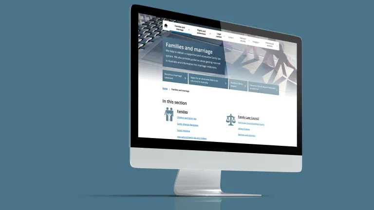
Morpht re-architected this site to structure 1,200 pages and more than 6,000 publications, factsheets and forms into 9 site sections and supported them with faceted searches to improve their discoverability. Landing pages now unpack popular content and navigate users to sought-after information.

UX / UI Design / Web development / Migration

Overview

Drupal 10 | Information architecture | Web development | Migration | Search

The Attorney-General’s Department delivers programs and policies to maintain and improve Australia's law and justice framework and provide legal services to the Commonwealth. The Department also facilitates job growth through policies that promote fair, productive, flexible and safe workplaces. 

The Department manages a large portfolio of sites to support its operations all while supporting the web publishing of all active Royal Commissions.

In late 2019, Morpht was appointed to redesign and develop five of their sites, four of which required content migration from Sharepoint to GovCMS. Working with the Digital Applications section, we developed and nurtured a highly integrated and collaborative partnership.

The Department website is the preeminent property representing and showcasing the important work of the five groups the Department comprises. 
Visit the site

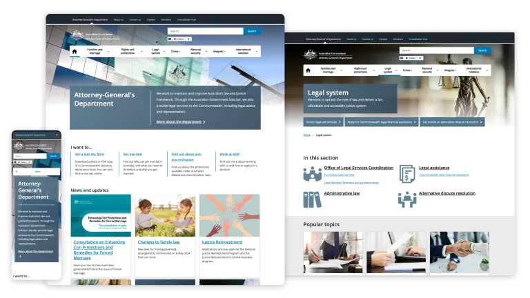
AGD website screenshots

The challenge

The Department website had been slated for a design update for a few years as it was starting to outgrow its structure and capability. Boasting more than 1,200 pages and in excess of 6,000 documents relating to eight distinct site sections, the need to migrate to a more scalable platform found in GovCMS had become pressing. 

Site search pooled all content into the one location making it harder for users to locate the information they needed. So it was no surprise that users relied heavily on Google Search to find documents and relevant content on the site.

Frequently accessed factsheets, forms and reports could only be found within the context of pages which made it difficult to locate those publications.

Inclusive design is beautiful design

With WCAG 2.1 AA accessibility standards in mind, we created a design aesthetic that modernises the site and supports users’ experience as they browse/search the content. We decluttered and simplified the interface to reduce interaction friction by leveraging a consistent visual language of the design system. Our focus was on a minimalist approach to champion and promote what users are looking for. 

We set the scene for each section with the use of immersive photography consistent across all constituent pages, publications and databases for that section. The experience is further enhanced with the use of iconography as visual signposts to guide users’ gaze through the pages. 

AGD website on multiple devices

Human-centred design

With a firm understanding of the audience personas, their informational needs and jobs to be done we conducted a deep analysis of the site structure and content and weighed that up against the Department’s objectives and publishing needs. 

Example of website wireframes

Guiding the user flow

We examined the content types and mapped out a user experience that relies on structured content to help surface information in the right context within the relevant section of the site. The new site architecture supports 8 distinct sections - each section behaving like a ‘site within a site’. The user flow is guided through a landing page - presented as a homepage for each section - where the user can explore the most popular content, factsheets and forms as well as navigate to deeper pages.

AGD user flow

Focused searches

What would you do if you can’t easily find a document? You use the search!
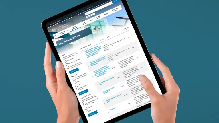
Knowing that users relied on Google Search to find publications and forms on the site, we designed nine publication libraries - one for each section of the site - supported with faceted searches. Users now can focus their efforts within the right section of the site and narrow their search down by filtering results by topic and document types. 

AGD focussed searches

Content migration

Content migration doesn’t have to be a neck-breaking chore when you’ve got access to the right expertise. We partnered with a specialist group, Systemik Solutions, who have more than a decade of experience in content migration for public sector websites. They used a SaaS tool, PerformX Content Workbench, which was specifically developed to migrate sites to the GovCMS platform. PerformX supports an iterative mapping and migration methodology that synchronises with Agile development sprints to minimise any necessity to freeze content maintenance. 

AGD cont migration

Making web development Convivial

We jump started the build by installing Convivial. This is Morpht’s custom built Drupal 8 distribution that adopts DTA’s Design System and turbo-charges it with a set of content components and layout modifiers. The site editor is then equipped with a variety of tools to zoom through the build of dynamic sites. 

The build included amongst other things:

  1. 19 content types and subtypes
  2. 8 page layouts
  3. More than 6,000 pages
  4. 9 document libraries with faceted search
  5. HTML navigable books
  6. Site sections with custom header photography
AGD Convivial

Moving house

In collaboration with AGD stakeholders, we designed a multi-step process of discovery, analysis, definition, test and final migration. The 6,000 documents 1,200 pages needed to be classified by site section, document types and topics to help users navigate to them and find them using faceted searches across the site.

We conducted a multi-tiered exercise in mapping:

  • Old pages structures to fit into new layouts;
  • Duplicate files with different formats into a new model of one publication page with downloads;
  • Pages and publication into different site section, assigned them topics and document types;
  • Redirected thousands unique URLs to new URL structures.
AGD homepage

Responsive design

 Mobile users expect to access information in a more streamlined fashion. To meet that expectation, we made sure we reduced clutter and maintain negative space for easy scanning of content for users on the go. 

AGD website displaying on a mobile screen

The client says

"Working with Morpht to develop the site on GovCMS has been a highly successful collaboration. Their expertise and willingness to explore problems and create effective solutions greatly benefited the end product. It also made the process of developing and migrating the site to the new platform a smoother and more effective one, even with the added complications of a dispersed workforce as a result of COVID-19 restrictions." 

Scott Wright, Digital Applications, Attorney-General's Department

Related case studies