Overview
The Australian Skills Quality Authority (ASQA) is the national regulator for Australia’s vocational education and training sector and seeks to ensure quality in the sector through the regulation of courses, training and providers.
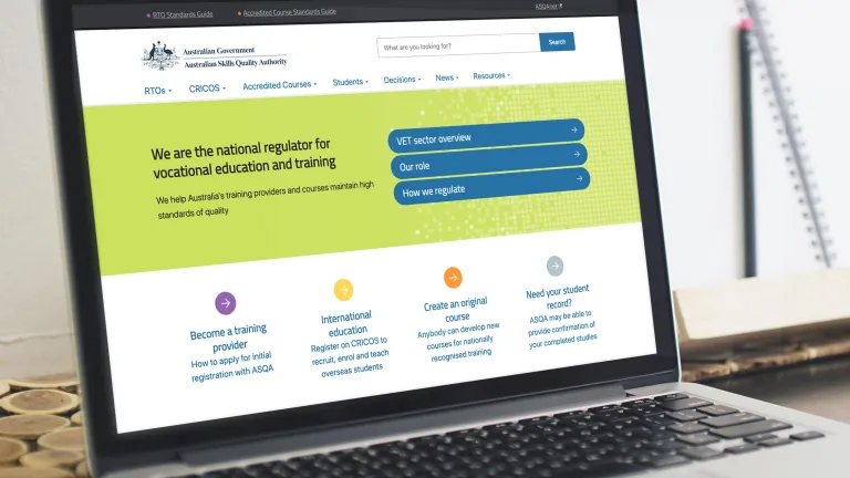
ASQA had recently gone through a rebranding exercise, and required the new style to be applied to the current site.
Morpht, having supported ASQA’s digital environment since 2018, were the natural web development agency to turn to for such as task.
The challenge
ASQA was wanting to make the most of the newly released GovCMS 8 platform which comprised in part of the UI Kit Starter theme. The Starter theme implemented the Australian Government Design System, a framework that incorporates usability and accessibility standards ensuring that the new site delivers a consistent experience for all users, in line with the Digital Service Standard. This was an important deliverable for the project.
A main driver for the project was to leverage the tools which came shipped with GovCMS to deliver an attractive website within a modest budget. The "flavour" of the new ASQA brand needed to be mapped across into the theme, while using the underlying framework of the design system. Under the hood, however, there was a migration engine that needed to be revved up to move the content of the site from Drupal 7 to GovCMS8.
The approach
Morpht was well placed to undertake the challenge. We had recently been commissioned by GovCMS to build the UI Kit Starter Theme for GovCMS D8. This placed us in a strong position to deliver - having been creators of the Starter Theme as well as completing further works (producing Convivial for GovCMS, a starter site, that extends the capabilities and delivers extra tools) which helped meet ASQA’s branding requirements.
Mapping the brand to the theme
We undertook an initial analysis of the ASQA branding guidelines and extracted the following key components:
- typography
- primary, secondary and accent colours
- backgrounds and textures
- imagery treatment.
Each of these aspects were mapped into features inside the theme
- Typography could be applied on a site wide level in the theme, ensuring that Editors adhered to a consistent style throughout the site
- Colours were mapped into various colour definitions in the theme. Each of these colours were converted to selectable options for ‘hero’ and ‘content backgrounds’, providing Editors with flexibility when creating areas of focus on web pages.
- Commonly used textures were also converted to selectable option for ‘heroes’ and ‘callouts’, providing Editors with versatile options when building out content rich pages.
- Other image treatments were also provided as editor selectable options.
The approach here was to map as much as we could into the theme and then deliver these styles as tooling to Editors, empowering Editors to build out the pages as they desire, while adhering to the required usability and accessibility standards.
Component driven design
During the wireframing and design stage of the project we uncovered a number of different components needed for the build of the site. Some of these components were extensions to what is found natively in the design system:
- Hero elements
- Item lists for titles
- Icons
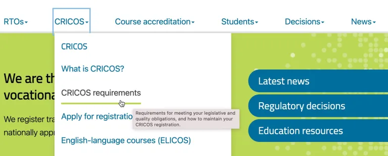
- Accessible menu
Each of these ‘components’ were implemented into the theme, in most cases utilising the Paragraphs module. This provides Editors with a modular and highly flexibly solution for adding content and laying out pages.
In the case of the menu for the main navigation, we adapted and applied the Adobe Accessible Megamenu library to support keyboard and screen reader accessibility standards.

Content migration
Anyone who's worked on a content migration project would warn you not to underestimate the job. We started by uncovering 14 different content types and their related structures. Mapped those to new page layout and views. Ran migration API workflows to manage most of the migration and supported that with custom PHP scripts. We created 11 custom PHP scripts to:
- manage the renaming of pages
- migrate taxonomies
- capture redirects from old pages to new
- create table of content component within pages where needed
- enable webforms
- check for errors during migration
- publish content in bulk.
The outcome
The end result is an attractive looking site which shows the benefits of using the GovCMS platform and the UI Kit Start Theme including:
- conformance with the Australia Government Design System and delivering a WCAG 2.0 AA compliant framework including the implementation of an accessible Megamenu navigation structure
- translation of the branding guidelines into a fresh and clean component based design
- easy to use editing tools that provide flexibility, so that Editors can easily build complex pages while staying on ‘brand’ and keeping the site compliant with accessibility standards.
- allowing Morpht to not only deliver a cost-effective solution, but within the required deadline:The site has been a success with the ASQA team keeping it up to date and relevant.
User focused
Site editors are now equipped with a suite of editing tools, making it easy to apply branding styles, create flexible layouts, and deliver an improved user experience.


