GovCMS8 ships with a UI-Kit Starter theme which implements the Design System, a standard style-guide for the use of Federal Government agencies. The Design System comes with a set look and feel with standard colours, fonts and other components. However, using GovCMS for your website doesn’t mean abandoning your branding and identity for standard out-of-the-box theme aesthetics.
The Design System has been designed to be used as a base and can be extended depending on your branding needs. With some deft design, you can enjoy the great power, flexibility and best-practice solution that is GovCMS with your own integrated branding, while maintaining usability and accessibility standards.
Morpht has developed a number of steps for mapping and applying branding across into the Design System. In this post I’ll outline the process we work through and demonstrate just how your brand guidelines can integrate into your GovCMS website.
What are “brand guidelines”?
In case you’re wondering, Brand Guidelines are a visual document - typically a PDF, that describes the colours, fonts/typefaces, imagery, graphics and voice and tone, to name a few, which make up the unique identity of your organisation. It’s the dos and don’ts of how to use your branding correctly to ensure it stays cohesive and consistent.
“What if we don’t have brand guidelines?” Call a panic meeting immediat… just kidding. It’s common to not have clearly defined brand guidelines, since guidelines are typically very well considered and presented; and therefore take a considerable investment in time and energy.
If you don't currently have clearly defined guidelines, we use your branding from any recent marketing and stationary to establish a clear picture to work from. This ensures the website seamlessly matches your existing identity, both online and offline. if you need help in the process, Morpht can assist in bringing your current assets together to form a basic set of brand guidelines.
What’s in play?
The Design System defines a baseline of functionality, structure and design. There is however, considerable room to move to tailor the look and feel of your website. The parts in play which we utilise when creating a tailored GovCMS theme consist of the following:
- Logo - and any colour/layout variations.
- Colour palette - typically these are divided between Primary and Secondary colour schemes.
- Fonts - Any typefaces used by you to associate text with your brand.
- Imagery - The type of images, their contents and how and where they are used or positioned.
- Graphics - Visual graphics such as icons and “graphic devices” and how they’re used and can be expanded upon.
With these elements clearly defined we can start to map them across to a GovCMS theme and things quickly start to take shape.
From the top
Integrating logos and colours
GovCMS has 4 colour concepts; Default, Alt, Dark and Dark-Alt. These options dictate whether text will appears light or dark depending on the background colour defined for each option. This helps to guarantee high-contrast, accessible content. We check colour palettes for colour contrast to make sure they meet AA accessible colour standards.
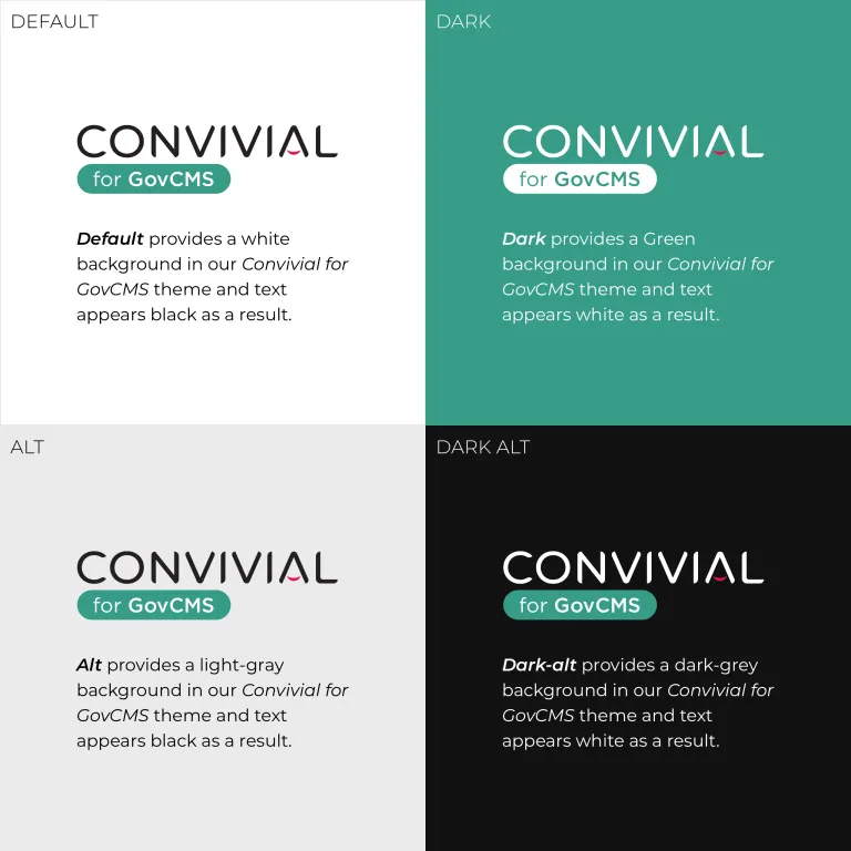
The system will apply lighter or darker text to a section of the page depending on the Editor’s preference.
We will also consider the logo variants available to use; and how best to use them together with the colour palette. The Header section, for example, might have a light background (Default), so a dark logo would be best suited for a high contrast - as shown above. Whereas the Footer section may have a dark background (Dark-alt) which would need a light logo for best accessibility.
Next, we use these colours to build an interactive style guide from the outset to demonstrate their usage across core components and for our team to reference throughout the build process. This dramatically speeds up the process of building a tailored theme to suit your branding.
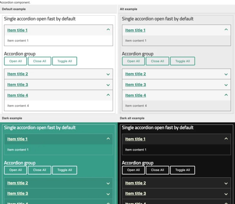
We integrate these colours into the GovCMS Design System, meaning they can be applied to sections of the website quickly and easily by Editors.

With the click of a field, a page section (built using our Paragraphs tool) will automatically adjust to the chosen background colour and contrasting text with no need for coding or complex configuration.
Secondary colours
We also consider additional, secondary colours where necessary. These colours are typically meant to be used sparingly so we may find them useful for highlighting certain components or elements such as text links, arrow indicators or visual graphics.
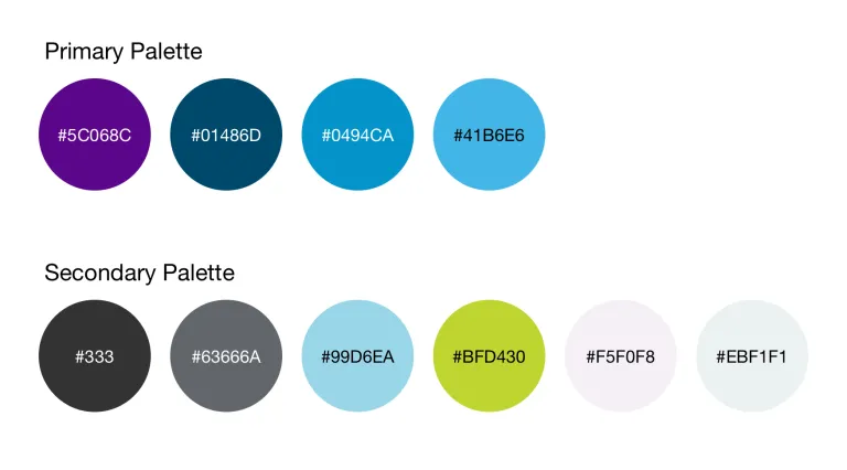
The Secondary colours don’t tend to resemble to Primary but compliment them well and add diversity and options to your branding.
We may, for example, use the #BFD430 light-green as an attention grabbing colour for notices and important information, since green doesn’t appear in the Primary colours.
Styled sections
Not only is it possible to integrate colours into the Design System for easy selection, we can also define Styles to adjust sections of a page with graphic “textures” and colours. This offers even more customisation based on your branding, with the same simple Editor dropdown-menu as the Colour Pallet method above.
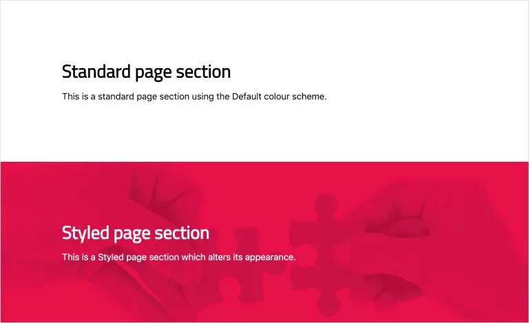
Styles have a predefined alternative appearance, in this example the Styled section uses our Convivial branded hands texture combined with our branded red colour as a background with white text.
Fonts
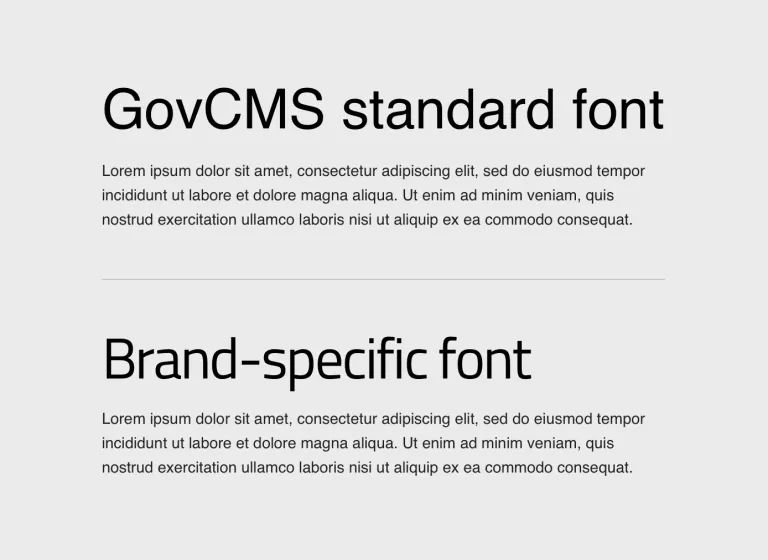
Font files contain individual typefaces and styles which dramatically alter the appearance of text. For this reason, brands usually have 1 of more fonts outlined in guidelines and we map them across for use on the website wherever possible. This gives your GovCMS website an extra degree of tailored brand association and can really transform the look and feel of a theme.
Imagery

Good use of imagery can grab the user’s attention, communicate what you stand for, and present your organisation’s personality. Images can be used to add context, to make sections or Call-to-actions more compelling, to trigger emotions and impact behaviour.
There are plenty of cases for when images should be utilised and when they shouldn’t and we take this into consideration throughout the project. We also consider the types of images which will suit the website and its audience and this is influenced by brand guidelines and user insight. With GovCMS being so flexible, it’s straightforward for Editors to add images where they please, so we try to set the tone and best practice before putting them in the driving seat.
Graphics
Much like imagery, graphics can dramatically improve user interaction, usability and aesthetics.
We carry across graphics from your branding wherever possible and necessary to harmoniously match your identity. Graphics, (or “Textures”) can be used as backgrounds for the site or for components, etc... Ie. the graphic may not be used to compliment "content" but more for overall look and feel.
Another common example of graphics are icons, which we can create to offer users a visual representation of certain key areas or content and to make pages appear more interesting or significant.

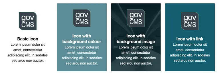
Each icon component has a different background style to demonstrate the flexibility and power in the Editor’s hands.
Morpht has a deep understanding of how GovCMS8 works and no matter the project or branding, we have the tools at our disposal to efficiently create a tailored theme within your new GovCMS8 website.
Don’t just take our word for it! Ask us for examples of GovCMS8 websites we’ve created recently with seamless brand experiences.
We’re more than happy to discuss your project and goals, so don’t hesitate to get in touch.


