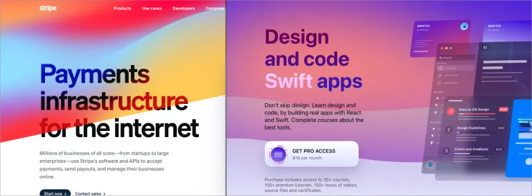
Bright vivid colours
While this trend might be counteracted by another - brutalism - you’ll find a gluttony of sites brandishing a set of bright colours emboldened further with soft gradients. This of course poses some accessibility challenges with text overlapping such backgrounds. Check out Stripe.
Animated background
The more courageous of the brands push their vivid colours even further with background gradient animations. Check out Qoals.
Glassmorphism
Peering through glass-like interface elements might hark back to Windows Vista times, and more recently with the latest builds of iOS. UI designers are taking it further with 'glassy' overlays to help text become a bit more accessible over gradients and bright backgrounds. Check out DesignCode.
Other trends to get you inspired
Stay tuned
We’ll keep you updated as we release some of these and more on Convivial.


