Creating responsive websites is easy these days with frameworks like Zurb’s Foundation and Bootstrap. However it may not be as easy for content editors to set up content responsively. Using the WYSIWYG API template plugin module, we can predefine templates in WYSIWYG, that helps editors to layout content in a mobile friendly website.
Install WYSIWYG API template plugin module
https://www.drupal.org/project/wysiwyg_template
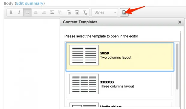
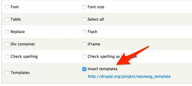
Once you installed the module, enable the WYSIWYG Template button in your WYSIWYG editor. Be sure you enable the “Insert templates” button, not “Templates”.
Create template
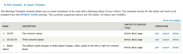
Define your templates in /admin/config/content/wysiwyg-templates
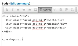
Make use of the grid system provided from you framework. The following is an example of 3 columns bootstrap layout.
<div class="row"> <div class="col-md-4">Left</div> <div class="col-md-4">Middle</div> <div class="col-md-4">right</div> </div>
Set up style in WYSIWYG
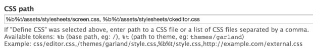
%b%t/assets/stylesheets/screen.css, %b%t/assets/stylesheets/ckeditor.css
Responsive layout is now a click away