At Morpht we are firm believers in the benefits and efficiencies which arise from using a standardised approach to building websites. A design system provides a stable foundation for implementers such as us to target. We are able to integrate the various components into a content management system (CMS) such as Drupal to put the power into the hands of the editor to make full use of the design system. The aim is always to provide as much flexibility as possible within the guard rails which are defined by the design system.
Morpht has been actively engaged with the NSW Digital Design System project since it was first announced. We have followed along with the development of the project, first developing Convivial for NSW when the initial version of the project was based around the Australian Government Design System. With version two of the NSW DDS a more “distinctly NSW” direction emerged with the design system branching out and developing new components and a more distinct look and feel. Convivial for NSW was rewritten to track these changes in version 2. Most recently, the NSW DDS has once again been refactored with a rewrite of the underlying components whilst maintaining the core essence of the look and feel. Convivial for NSW is now fully up to speed with this latest iteration.
What has changed in version 3 of the NSW DDS
A visual iteration
Visually speaking version 3 of the NSW DDS could be considered as an incremental improvement over its predecessor. This incremental approach has allowed the team behind the project to provide a backwards compatibility release for Version 2 which enables sites running on the older version to receive an uplift without major structural changes. The final version of Version 2 can be installed with relatively few tweaks to be implemented.
Complete rewrite under the hood
However, under the hood, there have been a number of changes to the way the components have been implemented. Rather than listing what has changed between versions, it is reasonable to say that almost everything changed. For our implementation this meant revisiting all of the templates and making sure that they were upgraded to support the new structure.
Some of the highlights of the new release include the following:
- New strategy for managing colours including branding and colour palettes.
- Use of CSS Variables for defining the colours and other key attributes.
- Reworking of the hero banner component to make it more flexible.
- More flexible use of colour palettes for page sections.
- More flexible approach in how components are put together, combining different aspects.
How does it rate?
On reflection the NSW DDS can be considered an excellent design system. In comparison to design systems in other jurisdictions it has strong features for:
- Being distinctive without being quirky or loud.
- Actively maintained with a strong community.
- Good use of options for editors.
- Good coverage of corner edge cases such as tables and forms.
- Sensible components which hit common use cases.
- Editor and implementer friendly classes which follow BEM principles but are generic in the areas where editors are working with HTML elements only.
The design team has done a great job and have gotten many things right with this release.
Dimensions for the win
Perhaps the best example of how flexible the system is is how it handles cards. There are five dimensions here which combine nicely to give a wide range and consistent outcomes:
- Headline and copy variants (x2)
- Different colour options (x3)
- Highlight support (x2)
- Image support (x2)
- Horizontal and vertical variants. (x2)
These five dimensions give editors a combined range of 48 options. This is a great range of flexibility for a single component. This is the kind of design we really appreciate at Morpht. We are able to implement each of these dimensions in select lists and the like, unleashing the power of the design system through a few simple form elements.
Our approach
During the planning and build of Convivial for NSW, Morpht has been guided by a number of guiding principles we have had success with on previous starter site projects:
Utilisation of Drupal best practices: The platform has been built around a solid set of layouts (Layout Builder), components (Paragraphs) and strengthened with a set of helpful utility modules to help editors (Layout paragraphs, workflow, scheduled transitions, notifications).
Security: A suite of security modules and approaches ensures that the application is as resilient as possible. Our sites have passed a number of external security audits and penetration tests.
Faithful implementation: We stick as closely as possible to the implementation provided by the NSW DDS.
Degrees of freedom: During the design phase we decompose each of the components and features of the design system we determine what is baked in and unchangeable and what should be controlled by the user. Where things can be controlled we then determine which user role should have access to that feature. We are then able to design our theme and components around these degrees of freedom. The result should be a good degree of flexibility for editors whilst not allowing them to create things which break the site or the brand.
Accessibility: This is a priority for all government sites and we do our very best to ensure that the sites are accessible. Where we find issues with the design system, we feed these back via the issue queue so that the design system can be improved for the future. Convivial for NSW compares favourable to other implementations in this regard.
Convivial for NSW features
| Feature | Implementation | Use |
|---|---|---|
| CSS variables | Theme settings | The new v3 version is driven by CSS variables under the hood. We have exposed the variables in the theme settings, making it easy to experiment and set colours on the fly without the need for a themer. |
| Hero banner | Component | Hero components can be added on pages as needed. They can be configured to be light or dark. |
| Hero Search | Component | This is a complex component with many aspects and the potential for variability in structure. |
| Cards | View Mode | The Cards display option can be selected by editors when building landing pages. There is full support for vertical and horizontal cards as well as a number of modifiers to configure how they will display. |
| Styles | WYSIWYG | The core styles defined by the NSW DDS are available as options in the WYSIWYG editor. Templates have been added to the WYSIWYG to support callouts and alerts. |
| Accordion | Component | Accordion components can be added on pages as needed. |
| Blockquote | Content | Blockquotes give prominence to a section of text quoted from another source. |
| Breadcrumb | Component | A breadcrumb displays a hierarchical series of links to help orient a user. |
| Buttons | WYSIWYG | Buttons provide users with the ability to submit an action or follow a link to another location. |
| Callout | Content | Callouts are a snippet of information that draws attention to important content. |
| Direction links | Views | Direction links show users how to navigate through a page or process. The direction of the arrow provides a visual cue as to the direction, which is supported by the text. |
| Footer | Component | The footer displays across the bottom of all NSW Government websites. |
| Forms | Component | Forms are used to capture data from users. |
| Global alerts | Content | Global alerts display across the top of the entire site to convey important information to the users. |
| Header | Component | Displays across the top of all NSW Government sites. |
| In-page nav | Component | The in-page nav (or "table of contents" as it is sometimes called) is placed above main content of a page and provides navigation to individual anchor links located in the main content. This is configurable and can be turned on for longer pages. |
| In-page notifications | Component | In-page notifications are used to contextually inform users of important information or status of an interaction. |
| Link lists | Component | Link lists are a structured way of displaying links to content with a common theme. |
| Main navigation | Component | The main navigation shows users the key areas of your site and helps them to find what they are looking for. |
| Pagination | Component | Pagination indicates to a user that a list of items has been split in to multiple pages. |
| Progress indicator | Component, Form | The progress indicator component shows the user where they are in a process. The component is design to work across different pages. Multistep forms have also been updated to use this component. |
| Side navigation | Component | A vertical list of links that shows the user their current position in the site hierarchy and enables them to navigate to other pages. |
| Social bar | Content | The social bar is designed to allow users to share something of interest via social media. |
| Tables | WYSIWYG | Tables provide a structured way to display information in rows and columns. This makes it easier for users to scan, sort and compare information. |
| Tabs | Component | Tabs are a form of secondary in-page navigation, helping to group different types of content in a limited space. |
| Tags | Content | A tag is an interactive element similar to a button. Tags contains a keyword or phrase that helps categorises your content. |
Convivial for NSW demonstration
In order to demonstrate the starter site in action, we have produced a demonstration site.
Please be sure to take a look at the test section which roadtests the various components and content types
We have also added an Examples page which showcases just how complete our implementation is. It is important to note that these pages have all been built by an “editor” user without the need for any intervention from a developer or themer. Our aim has been to provide editor tools to realise the typical use cases identified by the design system.
https://nsw.convivial.io/examples
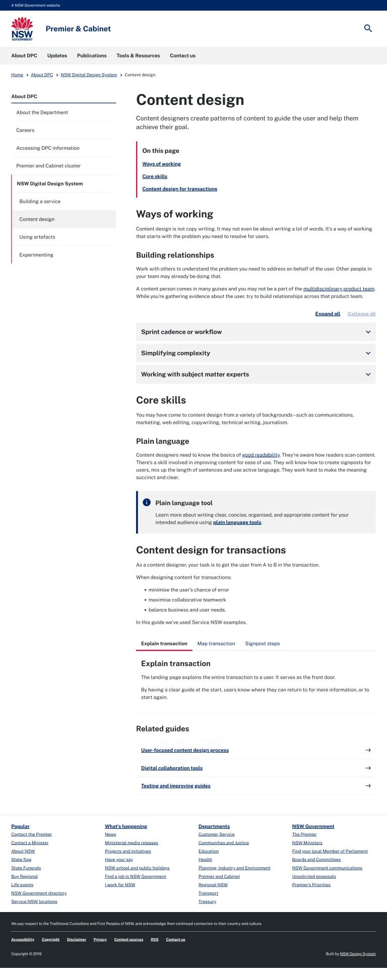
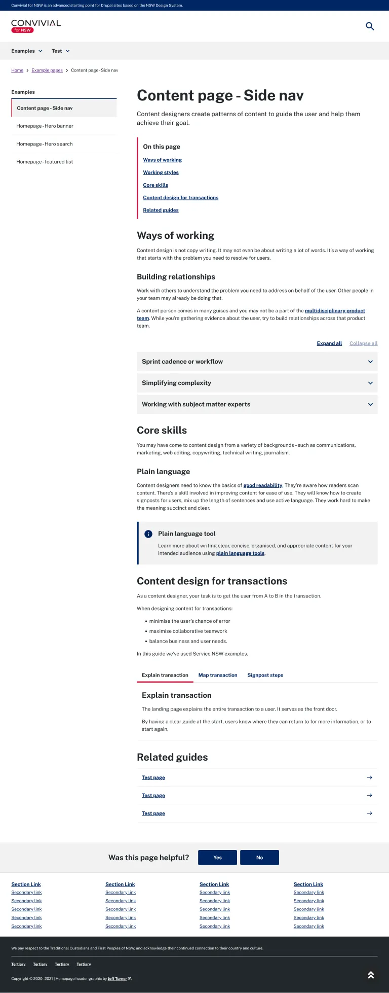
For example, reference implementation for Content Page - Side Nav is one of the more complex examples showcasing On this page, accordions, content tabs, callouts and listings.

And our implementation of this page as been provided as a comparison.

Who should use Convivial for NSW?
NSW government agencies are mandated to use the NSW DDS, depending on where they fall into the branding guidelines. There is a strong emphasis on bringing all sites under NSW Gov and so it is likely that this will be the correct place for agency sites to reside. However, for sites which do not fall within the capabilities of that platform, the use of Convivial for NSW is a viable alternative. Morpht has built a number of sites for NSW government agencies who have required the alternative. Convivial for NSW does offer a viable path for agencies who may need external integrations or the addition of advanced features which may require custom logic.
Find out more
If you think that Convivial for NSW might be of use to you, we are naturally interested in discussing your requirements to see how we can help. We will happily demonstrate the system to you and explain how it can be extended to suit your requirements.


