In the vibrant world of design, colour palettes serve as vital components for evoking emotions, setting moods, and conveying messages. However, beyond their aesthetic appeal, colour palettes also play a crucial role in the accessibility of your site designs. Designers have a responsibility to create inclusive experiences that cater to individuals with diverse abilities and needs.
Here’s how colour palettes intersect with accessibility and what designers can do to ensure their designs are welcoming to everyone.
Understanding colour blindness
Colour blindness, or colour vision deficiency (CVD), affects about 8% of males and 0.4% of females in Australia (Vision Eye Institute). People with CVD may have difficulty distinguishing between certain colours, particularly red and green or blue and yellow. Designers should consider this when selecting colours for their palettes to ensure information is conveyed effectively to all users.
High contrast for readability
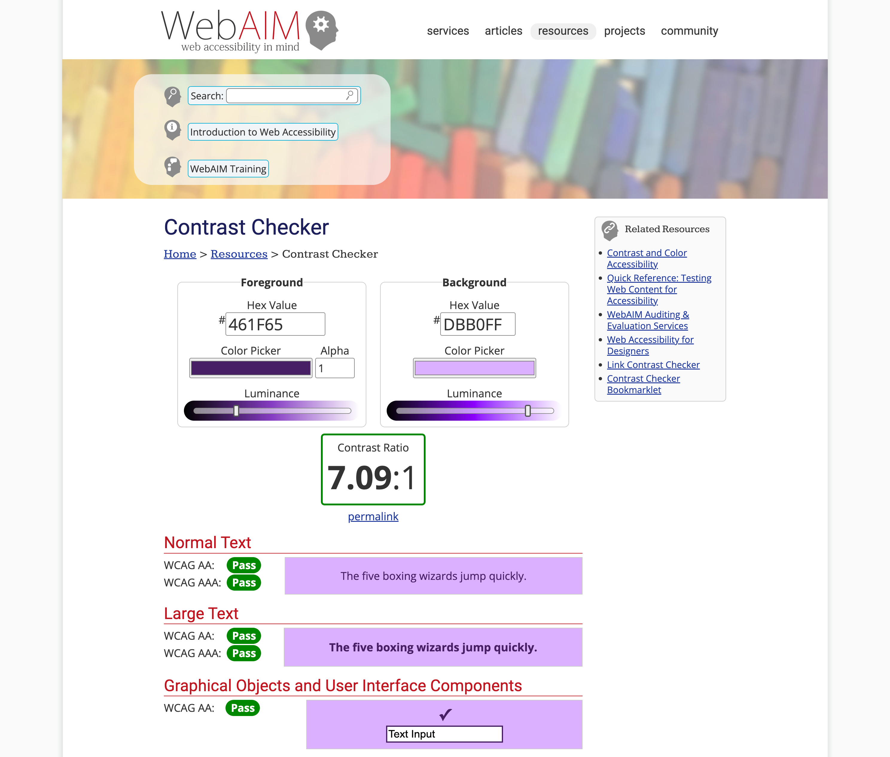
High contrast between text and background colours is essential for readability, especially for users with low vision or conditions. Designers should choose colour combinations that provide sufficient contrast to ensure text is easily legible. Tools like the Web Content Accessibility Guidelines (WCAG) provide specific contrast ratio requirements to guide designers in creating accessible colour palettes.
The WebAim contrast checker can help you test for WCAG AA and AAA contrast ratios and allows you to toggle the lightness/darkness to get a pass on your colours.

Providing alternative cues
Relying solely on colour to convey information can exclude users who cannot perceive those colours. Designers should supplement colour cues with additional visual indicators, such as icons, patterns, or text labels. This ensures that information is accessible to users with colour vision deficiencies or those viewing designs in grayscale or monochrome.
Testing for accessibility
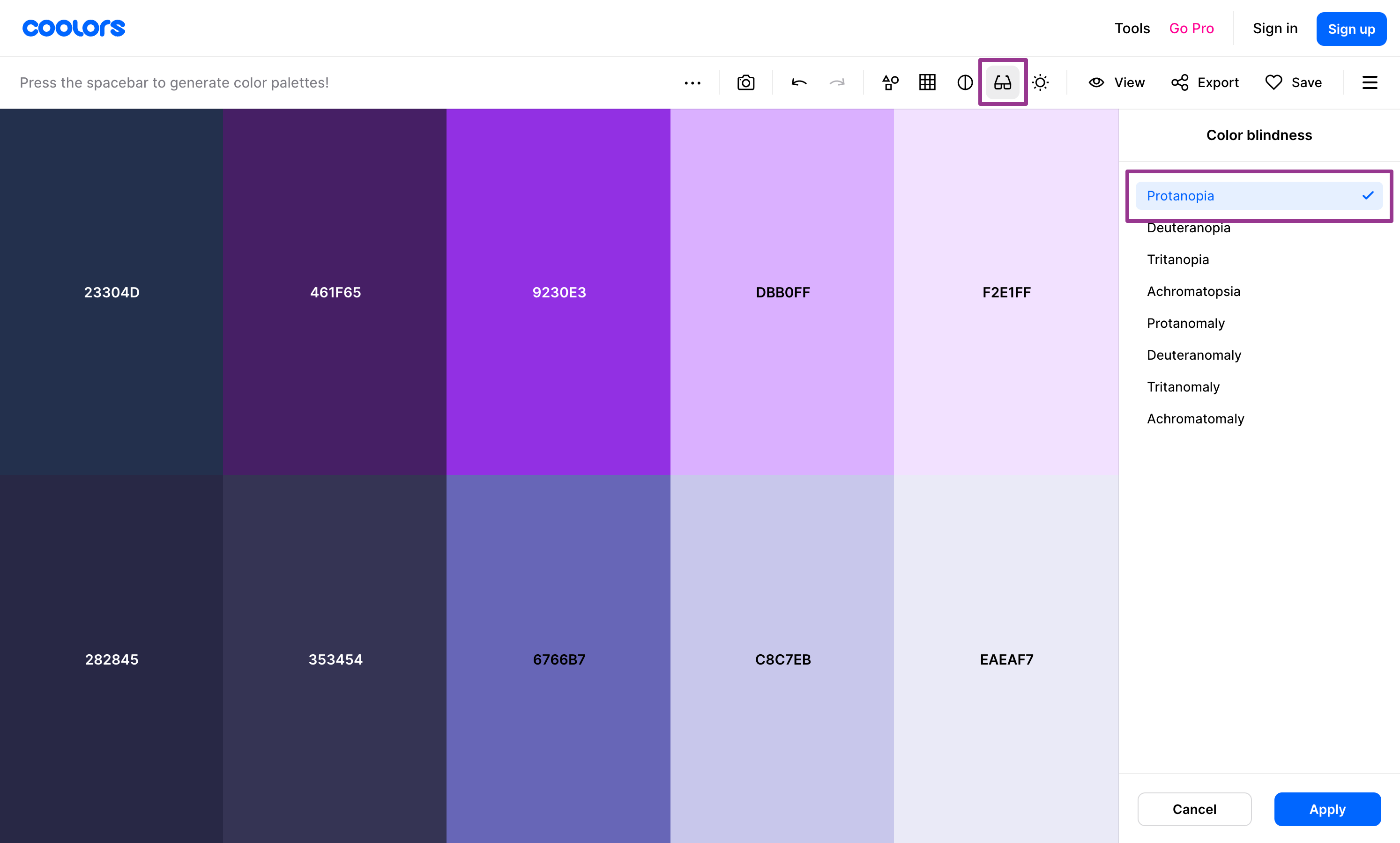
Designers should regularly test their colour palettes for accessibility using tools and simulators to check for various types of colour vision deficiencies. This helps identify potential issues and allows for adjustments to be made proactively. Additionally, user testing with individuals with different abilities can provide valuable insights into the usability and effectiveness of colour choices.
There are online tools, such as coolors.co to check how your colour palette will look for the various types of colour blindness.

What goes into a colour palette?
A website colour palette typically consists of several key elements, each serving a specific purpose in the overall design. When Morpht defines a colour palette, we define colours for each of the following aspects.
- Background colour: The background colour sets the tone for the website and provides a backdrop for other content. It's essential for creating a cohesive visual experience. The background colour may be a solid colour, a gradient, or even a pattern, depending on the design aesthetic.
- Text colour: Text colour is crucial for readability and legibility. It should contrast well with the background colour to ensure that the content is easy to read. For optimal readability, dark text on a light background or light text on a dark background is commonly used.
- Accent colour: Accent colours are used sparingly to draw attention to specific elements, calls to action (CTAs) or buttons on the website. They can be brighter or more saturated than background colours to create emphasis and visual impact.
- Link colour: Link colour is used to differentiate clickable text from regular text and should stand out enough to be easily recognizable. Link colours are often distinct from the background and text colours to ensure that users can identify clickable elements at a glance.
- Hover colour: Hover colour is the colour that interactive elements such as buttons and links change to when a user hovers their cursor over them. It provides visual feedback to users and indicates that the element is interactive. Hover colours are typically a shade lighter or darker than the default colour to create a subtle visual effect.
- Focus colour: Serves as a visual cue to guide users' attention to specific areas or actions, such as buttons, links, form fields, or interactive elements. This is essential for those who interact with the site using the keyboard.

Using light and dark colour palettes
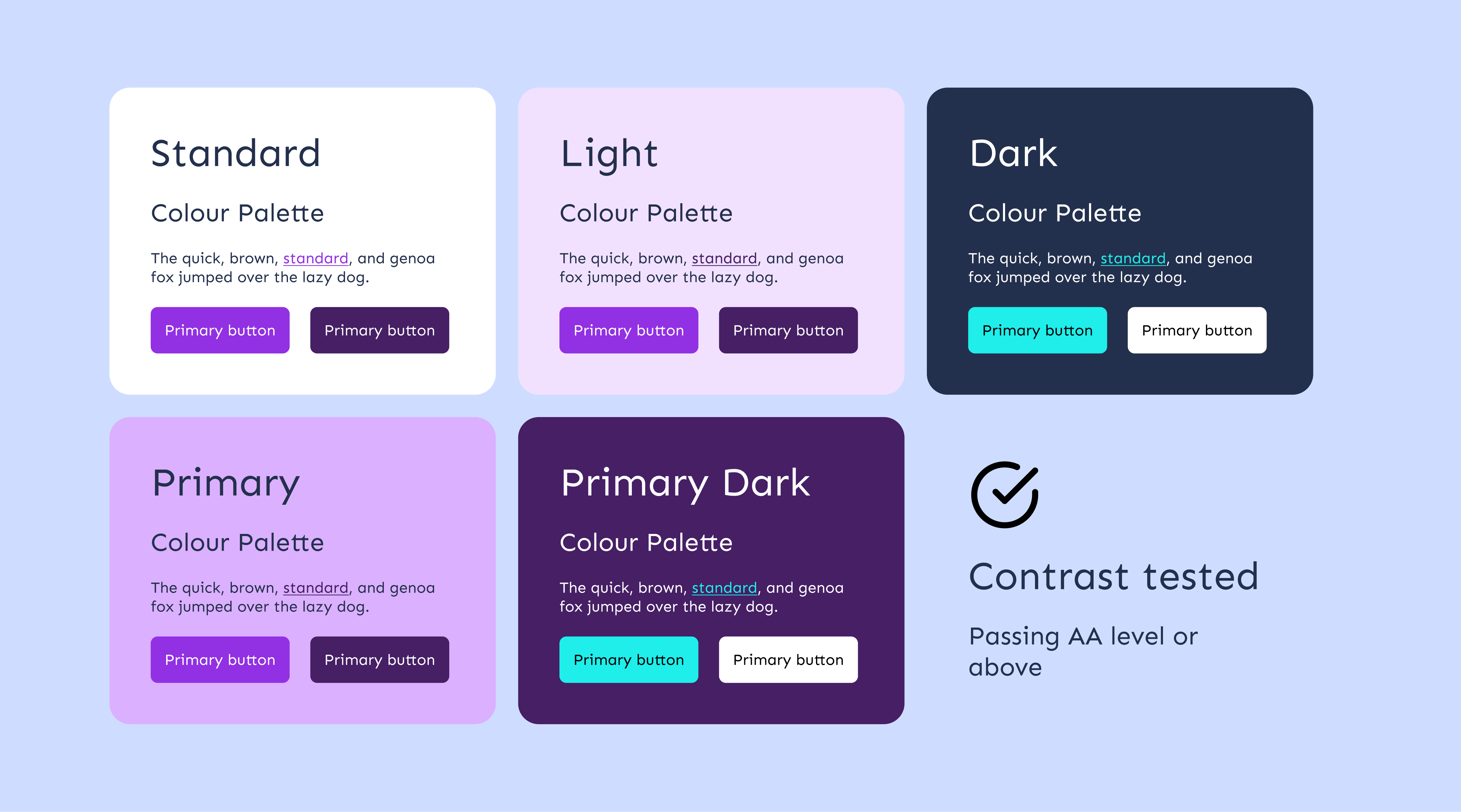
Ensuring that all elements of a colour palette work well on both light and dark backgrounds is crucial for creating a visually cohesive and accessible website design. Here's how each element might adapt across light and dark colour palettes:
- Text colour: On a light background, text is typically dark to ensure readability. On a dark background, text is usually light to maintain contrast and legibility.
- Links: Links should be distinguishable from regular text. On a light background, links may be darker or more saturated, while on a dark background, links may be lighter or brighter.
- Buttons: Buttons should stand out against the background to encourage interaction. Depending on the background colour, button colours may need to be adjusted for visibility and distinction.
- Hover effects: Hover effects provide visual feedback to users when they interact with elements such as buttons or links. The colour of hover effects may need to adapt based on the background colour for visibility and contrast.
- Focus: The focus colour indicates which element currently has keyboard focus. It should adapt to ensure visibility and contrast against the background colour.
- Accent colour: Accent colours are used to highlight important elements or calls to action. They may need to adjust based on the background colour to ensure they stand out effectively.
- Table Borders: Table borders should be visible and distinguishable from the background. The colour of table borders may need to adapt based on the background colour for visibility and contrast.
- Blockquotes: Blockquotes are used to highlight quoted text. The background and text colour of blockquotes may need to adjust for readability and contrast on both light and dark backgrounds.
Morpht’s approach to using colour palettes
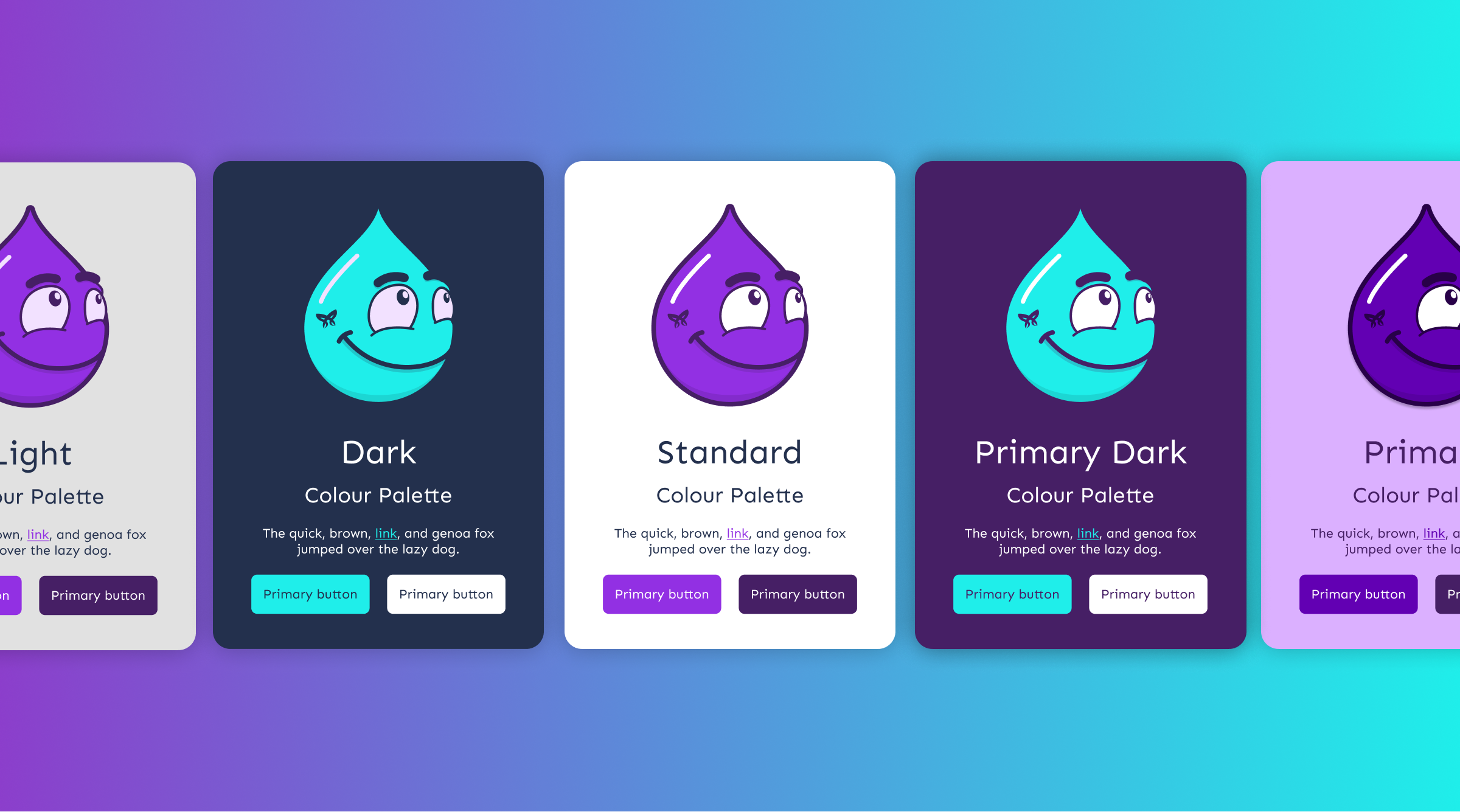
Morpht pioneered a colour palette system initially inspired by the Australian Government Design System (AuDS). Our colour palettes are now defined as an array of data that cycles through various colour schemes across the site.
As described above, we've structured our colour system around key variables such as foreground, background, text, link, accent, and focus colours, providing a comprehensive framework for modification. This approach allows content editors to seamlessly apply colour palettes to different content groups, ensuring consistency and flexibility.
For instance, when an editor chooses a dark colour palette to apply to a section, the text automatically adjusts to white against the dark background, meeting accessibility standards. This contrasts with the limitations of Bootstrap (BEM), where editors are restricted to predefined button colour options.
Morpht's method empowers editors with greater control and confidence in colour selection, facilitating harmonious design integration across diverse content elements.

Conclusion
Universal design principles advocate for creating products and environments that are usable by people of all abilities, without the need for adaptation or specialised design. When developing colour palettes, designers should prioritise inclusivity from the outset, considering the diverse needs and experiences of all users.
Embracing inclusive design goes beyond moral obligation; it also leads to better user experiences and broader accessibility. By considering the diverse ways in which users interact with colour, designers can create more inclusive and welcoming designs that cater to everyone's needs. Colour palettes should be thoughtfully crafted to prioritise accessibility without sacrificing creativity or aesthetics, ultimately ensuring that all users can engage with digital content and experiences.


